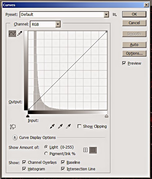
Curves is a means of changing the significance of pixels, brightening them or dimming them, in a non-linear way. Levels also changes the brightness of pixels, but in a strictly linear way, which means that all pixels get brightened similarly, whereas with Curves each pixel can be changed independently of others. That is not to say you must make the adjustment to each one separately, but you can make adjustments by brightness already on the image.
The controls are operated in a dialogue box, a panel.
There are two variants of the control panel, this one is the basis one and is classed as destructive. This means that it changes the actual data of the image, permanently. To undo that you'll have to go back to a previous History State.
 The other is Non-destructive in that it forms a separate layer you can add to the column of layers as they build up with repeated use of this variant of Curves, each being a separate layer.
The non-destructive version should be used if possible, but it doesn't have the means of adjustments that the destructive version has. My preference is for the destructive version, for its wider scope of possibilities.
The hatched box has a diagonal line, bottom left to top right and the borders to the box are darker at the bottom left. Note however, that this is only in colour images. Were it a greyscale image the dark and light in the left and bottom edges would be reversed. So to maintain a sense of normality for myself, when working with a greyscale image I change the "greyscale" in Image/Mode to "RGB", and though it will not bring colour to the work it will put the dark and light where I'm used to seeing them.
The line marks a "translation" from the pixel values on the bottom border to those on the left vertical border. With the diagonal line set corner to corner as shown, you may follow any vertical hatch line to the diagonal line and from there horizontally to the vertical border on the left. Counting the space will show that the pixel values will be unchanged.
But if you grasp the line with the cursor and left button of the mouse, you can drag the line left or right. Then measuring the distance from bottom to line and from line to left border will show a different value, and different for anywhere on the line where you measure, ie. the change in value will be non-linear.
Dragging the line up and to the left will lighten the image, equally the opposite is true.
The bottom left of the line works on dark parts of the image, top right on lighter parts, so dragging the line at the bottom left will lighten the dark areas or lifting the top will lighten the already light areas, mostly stars and light nebulosity.
If you click anywhere on your image a spot will show up on the line, and if you have the Control key held down at the time, the spot will be fixed on the line. You can put as many spots (anchors) on the line as you wish. You can use them to anchor the line to prevent parts of the image being adjusted. You can understand from this that the lower part of the line controls the darker parts while the upper controls the lighter parts of the picture. In our world that usually means the stars, so keeping the upper part of the line in check helps to keep the stars small and avoids fattening them up.
At the top of the panel is the Pre-set button where several built in alternatives are to be had. They automatically set the line to what the Pre-set says. To the right of this long button is a small three line icon, clicking on this will allow you to save a line for you to use later if you wish.
Below the Pre sets is the button that allows you to work on individual colours or RGB. When you do this it will help to have the histogram show you all the colours separately.
To the right is the Preview button, make full use of that.
Below the box are three eyedroppers, the left is for the black point, the right, the white point and the middle for grey. Double click on the left on and the colour panel will screen. The lower three boxes of the left column are R, G, B, and you can set them to suit the background you'd like to use as a standard. For my photographs I favour 22, 22, 24. PS may ask if you want these settings to be your standard. click OK if so asked. Changeable later if you wish. To use it - double click on the left eyedropper and the colour panel will screen. Click on OK, and it will clear, then click on a dark area of the image, a representative part you'd like to be set at the background colour, and it will be done, you can keep trying different parts of the image as many times as you like till satisfied then click OK.
The alternative for setting the black point is to use Levels and move the left slider towards the right, while watching the Histogram and the Info numbers. Avoid taking the slider into the Histogram itself, the black rising "mountain". This will "clip" the black and take all data out of the darker pixels, leaving full black. This is mostly background and a real sky background isn't black at all but a shade of grey, hence my chosen colours for the background.
The following two pictures show a before and after of an application of curves, a standard bow curve. It has brightened everything, the nebulosity more than other areas because that is near the middle of the line.


The third picture shows the bottom and top of the line held and the middle, where the nebulosity can be found, is stretched to brighten it. Compare with the others. It illustrates that you can produce a line of very odd shapes to suit the situation facing you.

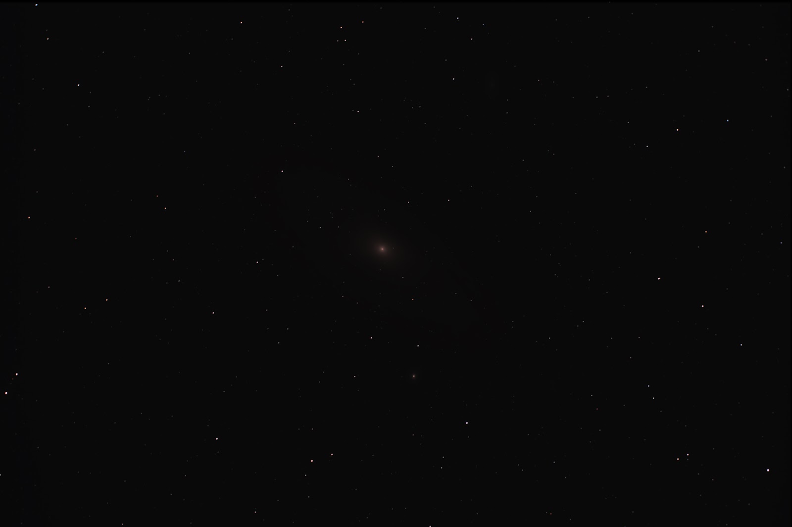
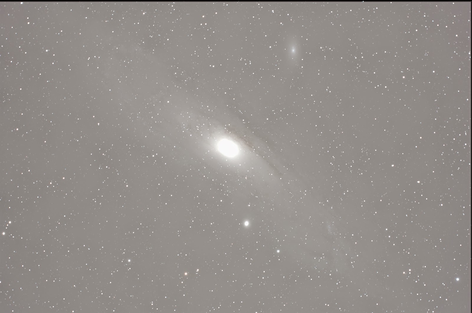
The upper of this pair is a stack of 14 frames, averaged. The lower is the same frames stacked by adding. The process is mathematical, the Average adds the pixels in their positions then divides by 14, whereas the Add just adds them. Illustrated here is the high dynamic range that M31 presents, very bright core and faint outer reaches of the galaxy. Adding alone saturates the core with 255,255,255 for the colours. Recovery of the core is impossible.
M42 and most Globular Clusters present similar problems.
The solution is to either use averaging or a mix of adds and averages, such as adding three at a time then averaging the adds. But generally it's better to stack by averaging alone, as the upper one.
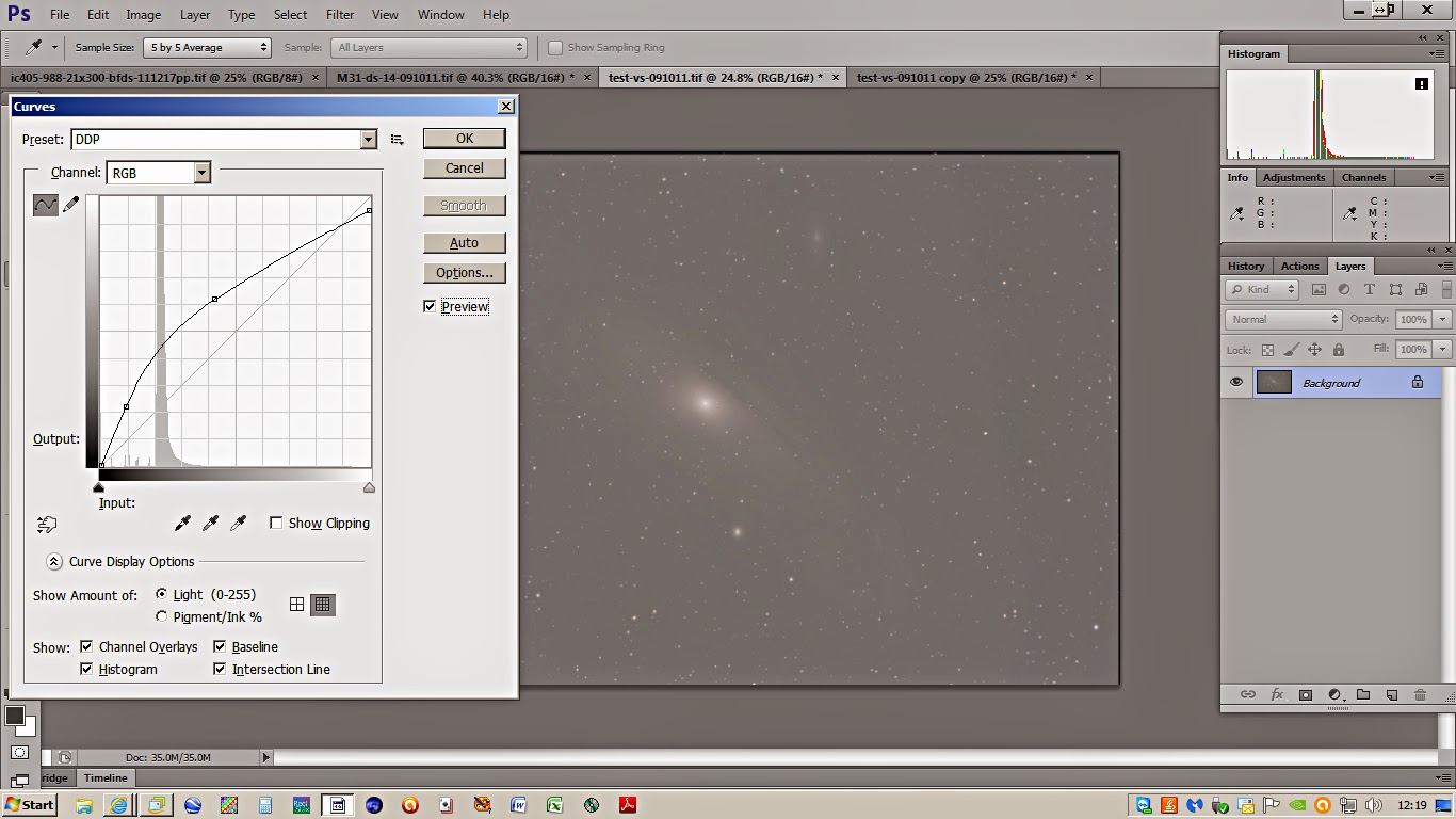
But this doesn't completely solve the problem of high dynamic range. The stretching must be done with care to favour stretching the outer parts at the expense of the core.
To do this use a DDP curve, as in the picture to the left. You can save a curve that you like by clicking on the small icon to the right of the Pre-Set button at the top of the panel.
Look carefully and you'll note a dark line along the top and right hand side of the frame. This is caused by the miss-match, in stacking, of the several frames that make up the image. It is good practice to crop all round the frame to produce a clean frame. It will clear the histogram of these little lines.
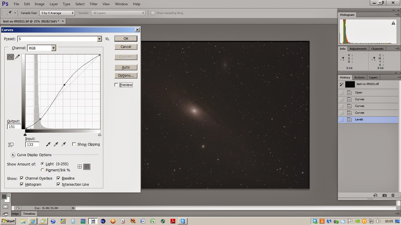
 Much is spoken of the S-curve, it's a more sophisticated means of increasing contrast in a photograph. You can see from these two pictures the before and after of an S-curve. Lowering the lower part of the line and raising the upper part, makes the darker parts darker and the lighter parts lighter. All must be done with care and as gently as possible. Very easy to do the job excessively.